May your Christmas Shopping be Merry and Bright
Top 5 key aspects of online shopping UX Researchers expect to see for Christmas...
Top 5 key aspects of online shopping UX Researchers expect to see for Christmas...
With the nights getting colder and darker, there is nothing better on a winter’s evening than lighting the fire, grabbing a glass of mulled wine, and snuggling down to watch a film to get you in the festive spirit. Cue, the user experience of choosing a Christmas movie. I’ve been exploring what helps and hinders the process of browsing for, shortlisting, and eventually deciding on a family-friendly film to watch, on the leading video streaming service, Netflix.
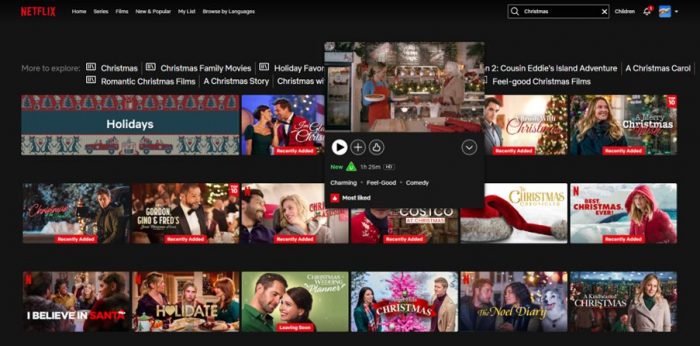
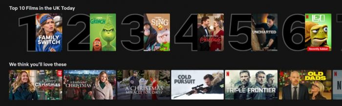
In the first week of December, I was expecting to be bombarded with festive content on the Netflix homepage. Instead, I caught glimpses of santa hats, twinkling lights, and the word ‘Christmas’ scattered amongst other genres in the familiar rows for ‘Tending now’ and ‘Top 10 films in the UK Today’. If you’re a Netflix user, experience will tell you that the categories displayed on the homepage are personalised based on complex algorithms, regularly changing to push different titles. Instead of bingeing another series of Below Deck, I find myself scrolling down in anticipation of a row titled ‘Christmas films’. To no avail, I resort to searching the word ‘Christmas’ which returns a selection of mixed content alongside a few categories to click into.
Whilst there are a few familiar favourites on the screen like The Grinch, I am confronted with numerous other films that I’ve never heard of (although to my surprise the progress bar that appears indicates I’ve apparently watched some of them before). Determined to discover something new, I set about narrowing down my options to find the next Klaus – a great Netflix original from 2019 if you’re after a recommendation! This results in 15 minutes spent scrolling, watching previews to get a taster, and looking at the release date and run times, whilst simultaneously trying to determine what I’m in the mood to watch, and keeping a list of potentials in my head.
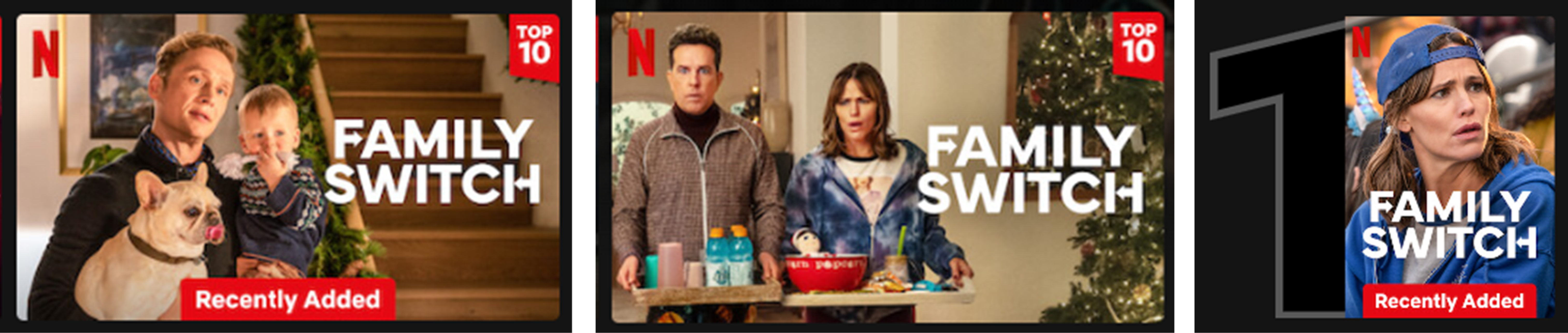
When hovering over a thumbnail, users are shown concise information to help them assess whether a film aligns with their preferences, including the content rating, duration, and genres for a film. The high contrast and restricted use of colour helps to draw attention to key details such as labels indicating when something is ‘New’ or in the ‘Top 10’, as well as the percentage match to the user’s profile, predicting their level of enjoyment.
The time taken for me to decide what to watch is increased by the number of films to choose from, reflecting a principle known as Hick’s law. As I invest more time, the final decision becomes more daunting as I’m afraid of picking something terrible, especially when there are external factors to consider like the fact the rest of my family are watching too! Can I really trust Netflix telling me a film is a 92% match? I end up going for the risk averse option and click play on The Holiday.
Whilst my Netflix subscription is staying on my wish list, the aesthetically pleasing design is hiding several usability problems on the platform. My experience of choosing a Christmas movie highlights the need for streamlined navigation, clearer distinctions between films, and reinforced decision-making for users. I’ll still be racking up viewing hours over the holidays but am intrigued to see what improvements lie in store for 2024.
 If you have any user research requirements, our experienced team can help, just get in touch.
Top 5 key aspects of online shopping UX Researchers expect to see for Christmas...
Top 5 key aspects of online shopping UX Researchers expect to see for Christmas...
We offer a wide range of UX workshops to extend your team’s thinking and support its success. Led by our experienced UX consultants...
We offer a wide range of UX workshops to extend your team’s thinking and support its success. Led by our experienced UX consultants...
We were approached to review and test an existing application to understand the user journey and discover what were the main pain-points and help to ...
We were approached to review and test an existing application to understand the user journey and discover what were the main pain-points and help to write a brief for a redesign...