Understanding how people engage with content to drive participation for the BBC
The BBC approached System Concepts to explore the many ways users participate with content available publicly online, as well as how they participate ...
Software applications often solve very complex problems for businesses and consumers and aim to fulfil specific objectives. But offering a product that solves problems is only half of the answer. If the UI is as complex as the original problem users may not be able to achieve their objective and go somewhere else.
Our client who builds software to help charities apply for financial support in the form of grants, was working on a new version of their grant management software. The previous version of the application was complex to understand and to use and the learning curve was steep, to say the least. Consequently, their share of this very specific market was under threat by their competitors.
The main issue was widely considered to be the out-of-date and unintuitive user interface which had been modified over the years with added functionality. So System Concepts were approached to review and test the existing application to understand the user journey and discover what were the main pain-points and help to write a brief for a redesign.
We conducted a workshop in order to:
The resulting brief covered the following:

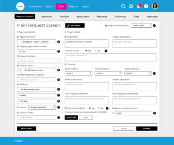
The final proof of concept designs needed to showcase how the tool could provide a more modern, intuitive and engaging experience for users. The design was felt to be modern, with good use of colour. Content was felt to be clearly sectioned and the example content (charts, applications and tasks) within the design was useful. Filter options were understood, along with the global navigation items and icons within the page.
During testing the design was described as ”attractive”, “clear” and “fresh”. Users liked the consistency in expanding / collapsing sections continuing through to this design and felt that they could quickly determine application status. Key calls to action were also prominent within the page, making next steps / actions clear.
The application provides one central system which includes a full range of modules providing extensive functionality which can track and manage whatever information users need.
An easy-to-use online application portal allows you to schedule grant rounds and downloads applicant data securely and automatically into the system. Standard and Bespoke analytical reports can be produced quickly, along with the assessment and grantee monitoring.
The application is designed to make it easier to keep up with the latest web technology, so that it will continue to be effective for the organisations that rely on it. The “white label” UI design means users can fully customise the look and feel of the software to their branding and easily adapt it in the future.

Use our research, testing and design expertise to streamline your products.
The BBC approached System Concepts to explore the many ways users participate with content available publicly online, as well as how they participate ...
A corporate travel company approached System Concepts to support the development of their brand-new travel management platform. Their aim was to ...
Our client wanted to better understand a sub-set of vulnerable customers, to build empathy and identify the crucial user needs to consider for this ...