Wayfinding at the Royal Festival Hall
 How design techniques can aid the navigation of physical spaces
 How design techniques can aid the navigation of physical spaces
What is it that makes completing a maze so difficult? Would it be easier if you had a map? Yes, but it probably still would not be that easy. Without any landmarks in a maze to orientate yourself, how would you know where on the map you were? Neither do you have the ability to get a good overview of any large area of space. And, of course, there aren’t any signs.
All of these factors make mazes difficult to navigate. Understanding these points and anticipating how visitors orientate themselves, are critical when designing a physical space’s wayfinding.
Wayfinding refers to information systems that guide people through a physical environment and enhance their understanding and experience of the space.
There are many techniques that can be used to ensure that a visitor is able to navigate themselves around and make sense of a physical space – the map being the best known of these.
Transport for London (TfL) states that effective wayfinding is, “based on the principles of mental mapping, progressive disclosure of information, consistency of naming, product design and graphic language.” But what does this look like in practice?
The Royal Festival Hall: a visitor perspective
 During events at the Southbank Centre, they have wayfinding volunteers, helping give people directions around the space.
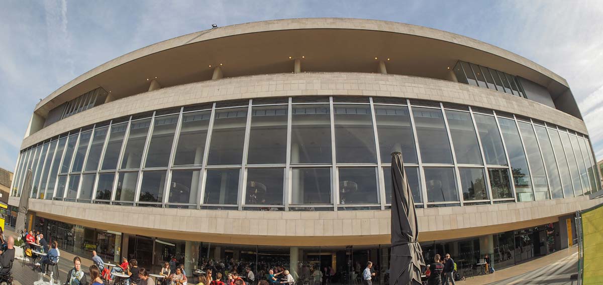
The Royal Festival Hall is a large, symmetrical building which has the main auditorium in the middle, suspended above the first and second floors. It has many further rooms and spaces, spread across six floors.
Mental mapping
The Royal Festival Hall has a lot of open space, giving you the ability to get a good view of different areas.
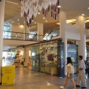
Signs and places within the building are often placed in visitors’ natural line of sight, giving you an easy overview of where you are in relation to other points within the venue. For example, the ‘Shop’ sign on the corner of the shop, shown above right, is placed in the natural line of sight from various points on the second floor, which make it easier to identify and find.
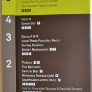
 Maps are also provided at crucial points, allowing visitors to understand where they are in relation to other things.
Landmarks are an important way of orientating yourself and creating a mental map of where you are. How often have you given directions such as, “take a left at the big supermarket, and carry on until you get to the roundabout”?
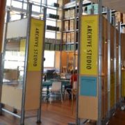 Spaces throughout the Royal Festival Hall are each given their own visual identity, such as the Archive Studio, pictured to the right. In this way they play the role of landmarks, providing memorable points of reference and making the space feel more interesting.
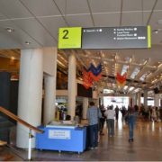 Product design: On each floor there are signs with a large number (as pictured to the left), clearly indicating which level the visitor is on. This may be particularly important for the many visitors who enter the Royal Festival Hall on the second floor. The large and obvious numbered signs make it clear to everyone which floor they have entered on, and prevents them from possibly assuming that they have entered on the ground, or first, floor.
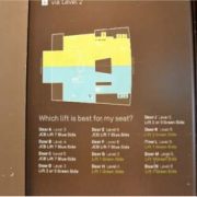
Progressive disclosure of information: Not all lifts at the Royal Festival Hall go to all levels. To avoid overwhelming visitors with information that is not relevant to them, this information is given only once, when you arrive at the lifts. Here a board tells you which lifts service which levels.
A similar technique is used to navigate visitors to their allocated entrance to the main auditorium. There are multiple entrances, each lettered, accessible from different floors of the venue.
Information on which lift is best used to access each door is provided on the second floor (where most people enter the Royal Festival Hall), next to the lifts. However, this information is not provided by lifts on other floors, neither is there much indication of where each door is located at other places within the building.
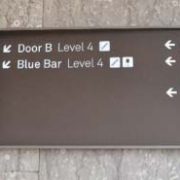 This is another example of progressive disclosure. However, from our experience, visitors often do not find it easy to locate their allocated door. The information supplied at the lifts, and elsewhere in the building, is therefore arguably insufficient, as it appears that many visitors do not have a clear mental map of where they are in relation to the entrance to the auditorium they want to find.
Consistent naming: All rooms and places are clearly named (e.g. the Archive Studios, and Shop, pictured above). These names are used consistently on boards and signs throughout the venue, as pictured above.
 Graphic language: To ensure that visitors can distinguish between the two symmetrical sides of the Royal Festival Hall building, one is designated the ‘Blue side’, and one the ‘Green side’. These colours are also used on the boards and signs on each side of the building. This use of graphic language is effective in creating a stronger sense of local identity between the two sides of the building, helping prevent visitors from confusing the two.
The wayfinding experience: remember to consider beyond the obvious
As the examples drawn from our experience at the Royal Festival Hall show, creating a good wayfinding experience is dependent on more factors than just a map or some good signs. These factors include consistency, use of graphic language, availability of landmarks, not overwhelming visitors with information, the architecture of the building, and presence of sufficient open space.
These are all important considerations when anticipating whether visitors will have a good understanding of where they are, and where they want to go.
 How we can help
For expert advice and research on improving wayfinding, get in touch