Using visual design to improve the user experience
User Experience & Usability
After conducting user experience (UX) research, we often find ourselves swimming in data that must be translated into clean, easy to follow deliverables for the client. If you have worked with us before, we may have provided an insights report, personas, journey maps, or wireframes to improve a service. Regardless of the format, we always strive to ensure that our deliverables are visually appealing (whilst also answering your research questions). Why? Because good visual design drives engagement, increases understanding and creates a great user experience!
We thought we’d share some of our tips on how to create an effective and concise visual design. The best thing about them, is that these principles can be applied to pretty much anything!
1. Use colour with purpose
When considering use of colour, it can be tempting to follow a well-established “rule” such as 60-30-10, pairing complementary colours and never daring to think about using more than one primary colour. All of these theories help to create a visual that is aesthetically pleasing, BUT there are some things that should be considered first. For example, every colour that you use in a visual design should have a purpose, such as to:
simplify interaction with a product or service by drawing attention to key elements on the page, for example calls to action
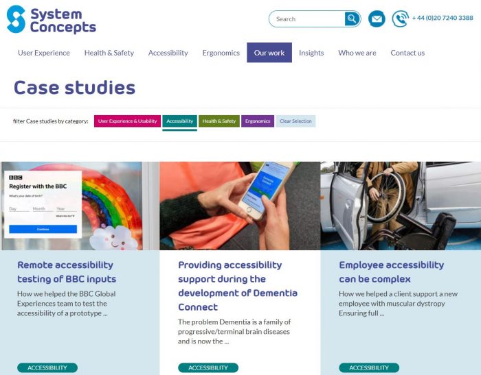
distinguish between different stages or topics, for example, at System Concepts we use four different colours to match our four service areas
match and reinforce the brand, which over time helps to evoke an associated emotional response from the user.
So, if you need to use more than three colours in a design, for example to differentiate six stages in a customer journey map, then do it. However, ensure that you use the colours consistently and sparingly throughout. The result: a visual that can be easily processed, with improved association, recognition and usability over time.
Bonus tip: Remember to follow the Web Content Accessibility Guidelines (WCAG) to ensure that your use of colour is accessible. This helps to improve readability for the rest of your users too!
2. Welcome white space
White space is the design tool you never knew you needed – don’t be afraid of it! Intentionally leaving areas of your design blank has the power to:
separate different topics, by creating a clear division between aligned objects, without the need for messy lines
create emphasis around a focal point, to attract attention from the user
improve legibility through use of margins, line spacing and typography.
This results in a structured, balanced layout, which reduces the user’s workload by making it simpler to search, process, and comprehend. Plus, it helps to reduce the amount of visible content, which gets you thinking about what information is really important to communicate. Anything that doesn’t add value for the user should be removed, and if necessary, included in a side note or appendix instead.
Bonus tip: Beware of creating false bottoms (or sides) in scrollable or zoomed content when using white space. You can achieve this by ensuring a responsive design, mixing up alignment, or providing an indication that more information is below.
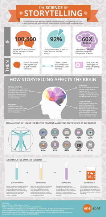
3. Use data visualisation to tell a story
Let’s face it, no one wants to scroll endlessly down a page of text or look at a table full of data. Get creative when presenting information by using videos, infographics or storyboards. Not only does this provide a more fun and welcome alternative to text, but visual information can also be processed more quickly, decreasing the workload for the user. However, “a picture is worth a thousand words” only if it can be efficiently and accurately interpreted. This can be achieved by ensuring your design tells a cohesive story with a strong, single narrative that is free of distractions. You can do this by:
succinctly introducing the topic
guiding the reader through an intuitive flow
making it easy to compare values and identify patterns or relationships
highlighting the key insights that support the message
including a key with clear labels for groupings or icons.
Bonus tip: Check out informationisbeautiful.net for some inspiration on how to create effective infographics.
4. Use understandable icons or graphics
As with colour, one of the primary purposes of imagery is to enhance aesthetic appeal. If you see a text-heavy poster on the wall, I bet you’d be less likely to read it compared to one that entices you in with some stylish graphics. When considering the user experience, icons and graphics should be relevant and support comprehension. They can also serve other purposes IF used correctly.
Used consistently, and in line with mental models, icons can improve recognition and tie together information relating to a common topic across one or multiple designs. Graphics help to tell a story, often with a primary focus and context that can be grasped at a glance. They also help to break up the page, save precious space and convey or elicit emotion from the reader. Where would we be without emojis?! However, you must consider the market and scenario where a design will be used, avoiding anything that may be ambiguous, and using text labels where appropriate. Oh, and don’t go overboard – having too many icons or graphics is distracting, not helpful.
Bonus tip: When using visuals in place of text, ensure that they are supported by meaningful ‘alt’ text to make them accessible to those using assistive technology.
5. But first, decide what is important
All of the above tips will help to keep your visual designs simple, beautiful and usable, whilst helping to focus the user’s attention. However, this doesn’t mean that you need to keep unnecessary information in the design. If you can’t think of the potential impact of an element (whether it’s an image, text or button), then question whether it really needs to be there.
Once you have a basis for the content, go back through the other tips. For example, think about how different pages or designs will tie together; use a consistent layout, clear icons, and consider whether infographics could help to tell a story to engage the user. Then, refine the design; ensure content is legible and distinct using white space, and last but not least, bring in the colour!
Our UX design team has wide experience in a diverse range of industries, and can apply a variety of visual techniques that take our research findings ...
Our UX design team has wide experience in a diverse range of industries, and can apply a variety of visual techniques that take our research findings to new heights...
We helped Les Mills to develop a more in-depth understanding of their customers by conducting research into user behaviours, needs and attitudes ...
We helped Les Mills to develop a more in-depth understanding of their customers by conducting research into user behaviours, needs and attitudes around their virtual classes...
Our UX team are always up for a challenge. So when one of our clients talked to us about a failing e-learning product, we jumped in with both feet. ...
Our UX team are always up for a challenge. So when one of our clients talked to us about a failing e-learning product, we jumped in with both feet. “Sure, we’ll create a web and mobile app ...