More accessibility tips
Read useful pointers on optimising digital content for users with cognitive diversity...
Read useful pointers on optimising digital content for users with cognitive diversity...
 Simple ways to improve digital usability and accessibility
With 1 billion (and counting) disabled people worldwide, it is as important as ever to ensure that your digital products are usable and accessible to everyone. But while it’s easy to agree with that statement, how do you actually go about making your website more accessible?
Our seven key accessibility tips will get you off to a flying start – we’ve even included examples of good practice to help illustrate each point clearly.
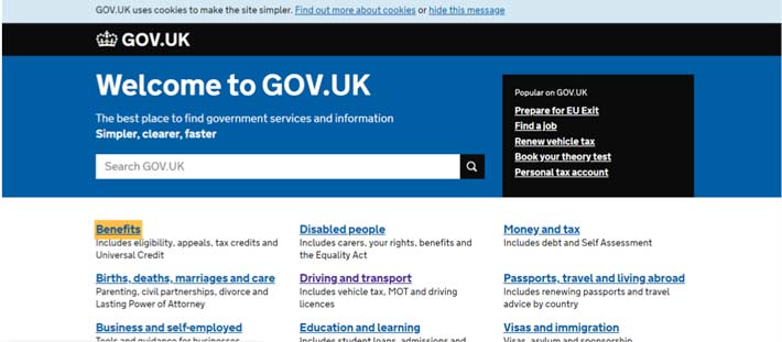
Making the item in focus clearly visible at all times helps anyone who relies on the keyboard to operate the page. This includes, for example, those with mobility impairments who may find it difficult to use the mouse. It lets these users visually determine the component on which keyboard operations will be active at any point in time. Additionally, it helps everyone, including people with attention, short term memory or executive processes limitations, by helping them to discover where the focus is located.
The screen shot below of the Gov.uk homepage clearly indicates (with a yellow box) that the Benefits link is in focus.
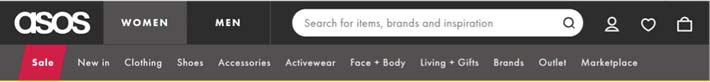
Low colour contrast makes it difficult for users with certain vision impairments to read content. As stated by WCAG (to level AA), colour contrast should be at a minimum 4.5:1 for small text (14px or less), or 3:1 for large text (18px or 14px and bold). Sufficient colour contrast is particularly important when considering mobile design because glare from mobile screens often makes it more difficult to tell the difference between colours on the screen.
The screen shot below of the Asos homepage shows white text on a red background (Sale) which has a colour contrast of 5.44:1. This makes it easily readable for all users, including those with certain vision impairments.
Information should not be conveyed using colour alone: users with colour deficiencies may not be able to differentiate between colours, which may prevent them from interpreting information correctly.
Other than different colours, use shapes, patterns or text to distinguish between elements. For example, in addition to the colour change, the selected option could be underlined, or the text label made bold.
In the screenshot below of the Avianca homepage, the Book your flights tab is selected. This is indicated not only using colour (the selected tab is in red and the rest are in black) but the selected tab text label is also underlined, whereas the others are not.

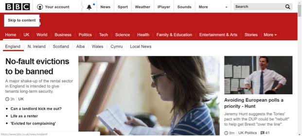
Skip links are very useful for screen reader and keyboard only / alternative input device users. This is because skip links enable these users to bypass certain content which speeds up navigation. Most often, these skip links appear at the start of each page and offer users an option to skip to main content. These links usually only visually appear when using the keyboard to navigate through the page immediately after landing on the page. When providing skip links, ensure that you do not make one of these 5 common mistakes .
An example of a skip link from BBC News is shown below.
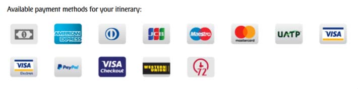
All images should be given a text alternative using the alt attribute. This HTML attribute allows assistive technologies, such as screen readers to communicate to visually impaired users what is shown in the image. It is therefore important that the text within the alt attribute is meaningful so that all users understand the information shown in the image. If the alt attribute is not used, screen readers will often announce ‘blank’ which may confuse screen reader users as they know that something is visually presented on the screen but they are unable to access it. Decorative images which do not convey any information should still have an alt attribute, with the alt text set to null (alt=””) so that assistive technologies know to skip it.
The below screenshot includes several images on the Emirates homepage which show which payment methods they accept. This is crucial information for any user wishing to proceed with a booking. The alt attribute provides a meaningful text alternative for each image.
Content that moves or auto-updates can be a barrier to anyone who has trouble reading stationary text quickly, as well as anyone who has trouble tracking moving objects. Providing an option for users to pause or stop the carousel from moving will allow them to control and absorb the content at their own pace (for example, this can be done by adding an accessible ‘pause’ button). It will also minimise distraction.
An example of a pause button on a carousel from the Lloyds Bank homepage is shown below.

Assistive technologies rely on the HTML code to understand page content and communicate information to users. It is therefore important that the correct HTML elements are used, so that assistive technologies correctly understand the components on the screen and how to operate them. Two examples of how to code elements correctly are listed below.
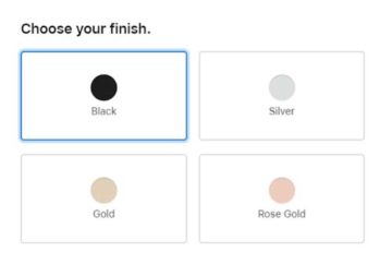 Radio buttons, which allow users to select only one option from a list of multiple options, need to be coded with the appropriate HTML elements. If done correctly, users of assistive technologies will understand that they are able to select one of the following options.
The example to the right shows a group of radio buttons on the Apple website.
Note three features in the code that make these radio button accessible.
It is important that heading markup (<h1> – <h6>) is used appropriately because it allows assistive technologies to present it to the user accordingly.
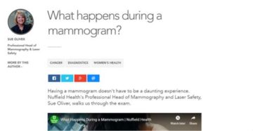 A screen reader can recognise the code and announce the text as a heading with its level, beep or provide some other auditory indicator. Screen reader users also often navigate a page via the headings on the page to quickly skim content and find the content they are looking for. Additionally, some assistive technologies use heading markup to change the look of headings to make them easier to read for users. If headings are not coded with heading elements, this will not be possible.
The screenshot above shows an article on the Nuffield Health website where the title of the article is appropriately coded within a <h1> element.
There are so many other considerations in making a website more accessible. If you’d like to advance your skills, why not attend one of our accessibility training courses to enhance your theoretical and practical knowledge. Our courses are run by expert consultants: we can create a bespoke course for your business, and also offer ‘off the shelf’ courses.
 How we can help make your website more accessible
Contact our team of experienced accessibility and usability specialists
Read useful pointers on optimising digital content for users with cognitive diversity...
Read useful pointers on optimising digital content for users with cognitive diversity...
Develop your accessibility knowledge and skills by attending one of our accessibility courses, led by one of our expert consultant trainers...
Develop your accessibility knowledge and skills by attending one of our accessibility courses, led by one of our expert consultant trainers...
Get up to speed on WCAG, widely regarded as the international standard for assessing accessibility of all digital platforms...
Get up to speed on WCAG, widely regarded as the international standard for assessing accessibility of all digital platforms...