Digital change can be scary – for the user
 How usability design techniques can ease the change process
 How usability design techniques can ease the change process
Changing or updating the design of a digital medium is generally seen as a good thing by those involved. But do users always share this view of digital change? Adam Smith, Senior UX Consultant at System Concepts, recommends a considered approach.
The designers, managers and other usability stakeholders involved in digital change see it as a chance to improve what is already there – a sense that pervades the entire design and rollout process. Whilst it may be hard work and consume time and money, only the positive effects are ever really considered.
For users on the other hand, the main feelings around digital change can be negative. The new design may offer them more options, nicer graphics, a sleeker design and a better navigation path – but the main thing they will see is change. And changing something you are used to can be bad.
Plan for the effects of change on your users
Personally, I hate updating some software. It currently does exactly what I want, how I want. Then it gets updated, and the tool I have used for years is gone – replaced by something ‘better’.
 How we can help:
Receive expert guidance and improve usability
The suggestion is not that digital products and services should not be updated. But the effect of change on users is something that needs to be considered, planned for and dealt with in the design and rollout process.
Applying the Kubler-Ross model: the 5 stages of reacting to a digital design update
User reactions to a new digital design are not always negative, but when they are, how can we turn this around? For these users, the cycle of feelings and reactions they go through can be similar to that of the five stages of grief. This is the model Kubler-Ross postulated and is something you are likely to have seen referenced in film, tv or books.
Here we are going to use the Kubler-Ross model to examine how users may be feeling, and to help design the rollout and delivery of an update to minimise and manage any negative reactions.
Kubler-Ross The graphic shows the stages of the model mapped against user performance. The stages are: shock, denial, anger, depression, acceptance and finally integration.
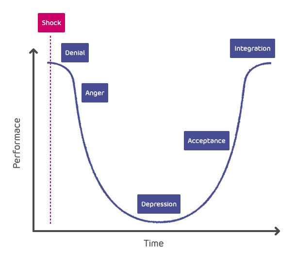
Shock
 When the user sees the new design for the first time. It’s not what they expected, and they have to deal with it. While the level and strength of shock will vary between users, its existence will negatively impact the usability and functionality of the tool to the user. If they are time pressured and feel unfamiliar with the tool, the shock level is likely to be high.
Denial
 The user starts to disbelieve the change has happened. They get angry and try to ignore what is in front of their eyes, vainly clicking in the places where familiar buttons once lay.
Anger
 This is when the real swearing starts! Keyboards get bashed, mice get viciously dragged across desks and buttons or screens get hit with increasing energy. From a usability perspective, this is when the user is the least easy to control and understand.
Implementation approaches to minimising the effects of the digital change cycle
Make incremental changes
One approach is to avoid one big change that the user can easily see, instead rolling out multiple smaller changes that over time lead to the same result. If the changes are small or inconspicuous enough then the user is never ‘shocked’, and therefore doesn’t enter the negative cycle.
This kind of process can take a lot of planning and design. If the entire information architecture of a website is ultimately going to change, working out how to slowly transition from one IA to another is still not easy. However, extra planning effort is paid back in the saved effort of not having to sell the new design to users, or in dealing with unhappy users.
Use information to accelerate change
 An alternative approach is to accelerate users through the change cycle by removing one or more of the steps. If users are warned beforehand that things are going to change, and the changes are going to be big, then any resulting shock is reduced. The other phases of the cycle may still be experienced, but anger and denial in particular may be reduced.
When alerting users of changes to come, it’s important to make sure the warnings are clear. If they get an email saying ‘the website design will change next month’ they may assume that the colour scheme and images may change, but the basic layout will not. To a designer the warning may be clear – but to the user it may not. So specific details need to be given. However if too much information is given, users are less likely to read it, so a balance needs to be struck.
Run systems in parallel
A third option, which may work for some organisations but not others, is to run the old and new designs in parallel, gradually weaning users off the old system. This offers users a safety net they can fall back on if they have to. It may be that the start of a purchase journey is on the old system, but the user is then moved on to the new system to complete their journey. However, they have the option to drop back on to the old system if they wish. Slowly, over time, the available functionality of the old system is removed.
Alternative design approaches
Alternative design approaches can also be adopted to aid the users of a new system. Designers need to accept and design around the negative feelings that some users may have, when the new system goes live.
Mitigating shock
Designing for, and accepting that users may be shocked, could involve information provision and navigation features. For instance, providing information around why changes have been made, and giving certain navigation features such as FAQs and help links added prominence to begin with.
Denial
 Users may try to navigate or interact with a system in the ‘old’ way: designing for this is possible. If a purchase process used to be 2 steps but is now just 1, clear messaging at the end stating that the transaction is complete and no more steps are needed, may be helpful.
Anger
Design changes may make some users angry – and more willing to complain than normal. Designers can anticipate this, for instance by making the complaints process as simple as possible, and by displaying selected explanatory FAQ answers at the tops of pages during each phase of the transition.
Depression
Positive feedback loops are always useful. During periods of design change, extra care and attention can be given to ensuring that positive reinforcement is used as much as possible. When experiencing the ‘depression’ phase users are less forgiving, so it’s doubly important that unachievable promises are avoided.
Think about unhappy users
To summarise, designers need to think beyond easy-going, happy users as they plan digital change. They must also consider the reactions of the unhappy, moody and short tempered human beings who will be using, interpreting and interacting with their designs.
We are all human and can have a range of emotions and reactions to new software and hardware. Remembering this and designing with it in mind can be a very beneficial to usability.
How we can help:
Receive expert guidance and improve usability