If like many employers, you’re planning to have employees back in the workplace when the Government remove the ‘work from home if you can’ guidance, the guidance on giving employees information on your workplace COVID controls is likely to remain.
While we’d be very surprised if anyone hasn’t seen any kind of COVID signage displayed over the last year (in shops and supermarkets and so on), employees who have been working at home since March 2020 are unlikely to be familiar with changes made in a workplace.
During this period of easing restrictions and the success of the vaccine roll out, it’s also important to ensure that people don’t drop their guard.
So, how’s your COVID-19 signage looking? Julie North, shares her thoughts on things to consider.
Don’t be too texty
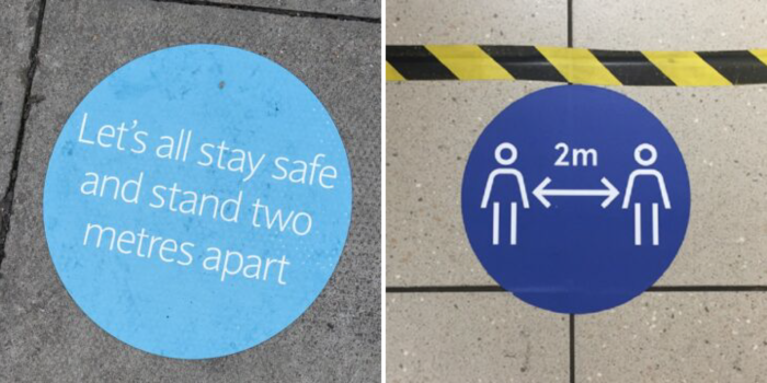
Signage should provide a ‘call to action’, in that it should give instruction or direction quickly, like ‘stand here’ or ‘stay 2m apart’. Graphics are a great way to reduce text in signage which will help people who might have low literacy levels, reading disabilities or where English isn’t their first language.
Compare the two images below – which do you think has the better call to action?
To brand or not to brand?
Many companies have strict corporate branding, but does branded COVID signage simply blend in with all other signage and lose its message? A well-known supermarket chain with orange branding uses bright blue COVID signage which contrasts well.
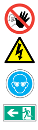
There are universally accepted colours for signs used in the workplace and on the roads, e.g., red for danger or prohibition, yellow for warning, blue for positive instruction or mandatory behaviour, and green for safety. Reflecting these colours could help people quickly understand what they should or shouldn’t do.
If employees work in more than one workplace, keep sign design consistent to avoid confusion. On a recent walk into neighbouring Hackney, I saw many shops displaying the same council designed poster, so for people visiting shops across the borough picking up craft coffees and sour dough pizzas, they all received consistent messaging.
Language matters
Messages which convey information on becoming ill, death, becoming a COVID statistic or even disciplinary threats for non-compliance are probably going to be unhelpful. Scare tactics could drive people away from the workplace and reinforce any existing fears people might have about returning to work.
Consider audience needs
Do you need to think about how accessible your signage is for disabled people? Signs at varying heights will accommodate standing people and wheelchair users. Do you have capacity to install Braille signage or a means to give information verbally? Also consider colour contrast of text against a background.
Location, location, location
Signs on floors are looking pretty grubby now aren’t they? If you don’t have to have signs in areas where there is high footfall on the floor, consider displaying signage using structural columns, pull up banners, or poster stands, or make sure you keep on top of replacing signs as they become unreadable.
Layout and text size
I’m not suggesting you start sourcing designers for your signage but consider things like text size and layout as these can impact how signs are read, and how legible they are.
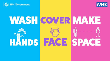
The Government hands, face, space poster below was criticised in an Financial Times article on the best and worst COVID posters. Not centering the text and images in each of the coloured columns makes the top line read ‘wash cover make’ which doesn’t make sense.
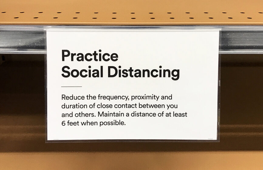
I’d probably struggle to read this supermarket shelf sign if I’d left my glasses at home (which means I’d actually not read it at all).
We have many years of digital accessibility experience, and we want to help ensure that companies provide accessible products and services to their ...
We have many years of digital accessibility experience, and we want to help ensure that companies provide accessible products and services to their userbase. Something which is crucial every day...
You’ve carried out a COVID-19 risk assessment for your workplace to identify transmission risks and the mitigating measures needed, but what about ...
You’ve carried out a COVID-19 risk assessment for your workplace to identify transmission risks and the mitigating measures needed, but what about your other risk assessments...