World Usability Day 2018 focused on making day-to-day services and products easier to access, and simpler to use.
“No one should have to suffer through products and services that get in their way. People should not be made to feel stupid by technology.” (Worldusabilityday.org)
What do you think about evil UX?
User experience (UX) refers to a person’s emotions and attitudes about using a particular product, system or service. Good UX is about making these products, systems and services easy to use, understand and access. A user centred approach to design is generally a good step in the right direction with Jakob Neilson’s 10 usability heuristics often used to form the basis of good UX design.
But what about ‘evil’ UX design? Bad UX is easy to spot and could be defined by the absence of good UX.
However, ‘evil UX’ is where a person’s interaction or experience with a product, system or service is not what they expect, and where they may be manipulated for a purpose that is not initially clear. Often used as a way to make money from unsuspecting users, evil UX can also be used to get users to sign up for marketing notifications they don’t want, or can leave users misinformed about how their data will be used.
Evil research and dark patterns
I thought I would do some research on how UX design could be used for evil… https://darkpatterns.org/ identifies 11 different types of ‘dark patterns’ that are considered ‘evil’ UX. Visit this website for a full description of all the ‘dark patterns’ that they have named. I was curious to see how many examples of these ‘dark patterns’ I could find in a day of normal internet usage (through both work and personal usage) – and was surprised by the number that I came across in such a short time!
UX for evil example 1 – bait and switch
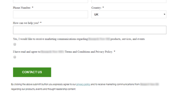
‘Bait and switch’ is where the user sets out to do one thing, but a different, undesirable thing happens instead. For example, when recently requesting an online quote, I landed upon this page (see below). I carefully read the captions for the checkboxes to avoid signing up for marketing materials that would inevitably clog up my inbox – so I made the conscious effort to not tick the first box (“Yes, I would like to receive marketing communications regarding Company X products, services, and events”).
However, after reading the small print below the ‘Contact Us’ button, it seems as though I was still agreeing to receive marketing materials by simply requesting the quote! Sneaky! (In case you cannot read the small print, it reads; “By clicking the above submit button you expressly agree to our privacy policy and to receive marketing communications from Company X regarding our products, events and thought leadership content.”)
UX for evil example 2 – trick questions
Use of trick questions or confusing sentences that can be worded to make them more difficult to understand, often using double negatives to make the proposal more ambiguous. An example would be: ‘Untick this box to receive information about our future offers.’ Rather than: ‘Tick this box to hear about our future offers.’
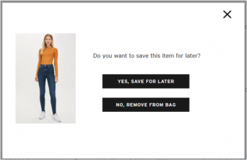
While shopping online I tried to remove an item from my basket. Upon clicking on ‘remove’, the pop-up displayed below appeared. In my haste, I thought the pop-up was being helpful and asking me if I was sure I wanted to remove the item from my basket. I clicked on the ‘Yes’ button and was redirected to a page where I either had to create an account or log-in to my existing one. After spending a few minutes trying to remember my password I managed to log-in to my account only to find those pesky jeans still in my basket!
UX for evil example 3 – creating urgency
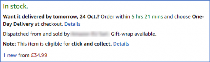
Creating a sense of urgency can be a powerful method which pushes shoppers into making a faster decision on a purchase they’re considering. There are several ways to employ urgency as a sales tactic – showing that stock levels are low or use of countdown timers. Countdown timers are a clear visual cue which tell customers that, if they want a product, they must take action within a specified period of time. This could be a countdown until the end of a sales period, or for an offering such as next day delivery (see example below).
Many sites use similar tactics when they have a special offer on or if you place an item in your shopping basket, it will remain there for a certain time period. This is a method that is used to increase online sales and can lead to shoppers making panic buys or dissuade them from shopping around, for fear that the deal will expire, or they will miss out on an item.
UX for evil example 4 – currency dissociation
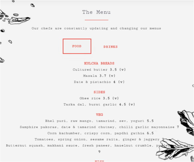
Evil UX isn’t just limited to the web however – some restaurants (usually the fancy ones) apply a clever technique to menus, using numbers without a currency indicator (£). The idea is that missing out the currency attached to a number will disassociate the physical idea of money, so in theory, customers will spend more without feeling as if they are spending anything. I experienced this technique when I ate at a restaurant in Soho, London. Whether this was intentional or not, it certainly worked on me!
…The food was great though!
UX for good or evil? Have your say at World Usability Day 2018

 While shopping online I tried to remove an item from my basket. Upon clicking on ‘remove’, the pop-up displayed below appeared.
 Get expert help with ‘Good UX’