Three reasons to focus on web accessibility
Three practical reasons why we believe you really have to start considering web accessibility....
Three practical reasons why we believe you really have to start considering web accessibility....
Graphic icons are a powerful way to enhance usability and accessibility in apps and online, but only if they are chosen and implemented with care. Here are some tips…
![]()
The main purpose of using icons on websites and apps should be to quickly convey meaning. Yet my experience of user testing shows that icons often do the opposite.
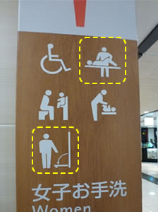 In Japan, images are widely used within public notices, instructions and information. I thought that this would be really helpful to me on my travels (I’m not yet fluent in Japanese), however I found many of the images used were difficult to interpret. For instance, this notice appeared just outside the women’s toilet at Osaka airport…
Similarly, online imagery and icons can prove less than intuitive. Delivery information for an item I purchased on eBay recently, contained several icons that did not make much sense to me – until a tooltip came to my rescue!
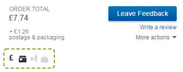
Similarly, online imagery and icons can prove less than intuitive. Delivery information for an item I purchased on eBay recently, contained several icons that did not make much sense to me – until a tooltip came to my rescue!
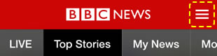
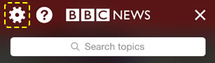
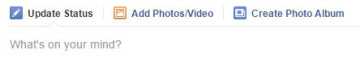
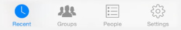
1 – Choose commonly used icons. Most users will recognise the hamburger icon as the Menu and the wheel icon as the Settings, but they may not understand the purpose of less commonly used icons. Popular, simple icons are much more effective than unusual beautiful icons.
2 – Provide text labels. Text labels help many users correctly interpret icons.
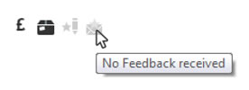 If you cannot, or prefer not to, display text labels next to icons, you can provide the same information via a tooltip instead. In this case, remember to make your tooltip appear not only when users hover over icons with the mouse, but also when they reach the icons via the Tab key of their keyboard.
3 –  Be consistent. The first time users encounter an icon, they learn the meaning or function associated with it. Using that same icon elsewhere or for a different purpose will disorient them. I once tested an app where the hamburger icon indicated that an item was draggable, and I observed several participants tapping on it expecting a menu to appear instead. Make sure that you give each icon on your website or app one meaning only.
4 – Provide alternative text. When icons convey important information or are actionable, blind users must be provided with alternative text describing the purpose of the icons (e.g. ‘menu’). Depending on the way icons are implemented, this can be achieved by using the HTML alt attribute or adding hidden text. Alternative text is not necessary when icons are simply decorative or are accompanied by a visible label.
5 – Avoid tiny icons. Size matters. Really small icons are problematic for all users, and especially for those with visual impairments. Tiny icons are also difficult to activate with a mouse for users with limited fine motor skills (including older users), and can be hard to select on mobile device screens. When creating icons for apps, ensure that the size of their touch target area is at least 9×9 mm.
6 – Test, test, test. How do you know whether the icons on your website are as clear and meaningful to your users as they are to your design team? The only way is to test them with real end users. Issues with icons generally come up during lab-based user testing sessions, even when they are not the focus of the research. However, if you are mainly interested in collecting feedback on icons, you may also consider using alternative testing methods, such as remote testing, that may allow you to collect data from a larger number of users.
 Need expert help to implement or test your icons?
If you need specialist help to test the usability and accessibility of your icons, feel free to get in touch with us.
Three practical reasons why we believe you really have to start considering web accessibility....
Three practical reasons why we believe you really have to start considering web accessibility....
As part of Global Accessibility Awareness Day 2015, we conducted a free expert usability review of the Early Shakespeare online trial created by SEN ...
As part of Global Accessibility Awareness Day 2015, we conducted a free expert usability review of the Early Shakespeare online trial created by SEN Assist. SEN Assist is a small company creating ...
Ensure your designs work for people with disabilities by working with one of our accessibility experts....
Ensure your designs work for people with disabilities by working with one of our accessibility experts....