With 1 billion (and counting) disabled people worldwide, airlines are making an increasingly conscious effort to ensure that their digital services can be accessed by all users, including those with a disability.
An increasing proportion of airlines’ services are now offered online, from booking flights to checking in. In fact, Avianca’s CEO has made it the company’s goal to become ‘a digital company that flies airplanes’. Ensuring that all users can access these services is not only the right thing to do, but is also a legal requirement for all airlines that fly to the USA, as stipulated in the Department of Transportation mandate which requires all airlines to comply with Web Content Accessibility Guidelines (WCAG) 2.0 to AA level. WCAG are the internationally recognised set of guidelines aimed at improving the accessibility of digital products. The guidelines address many issues encountered by people with vision, hearing, mobility and cognitive impairments.
Our work at System Concepts puts users at the heart of digital product development through technical expertise, user research, and design. This ensures that all users, including those with disabilities, have delightful experiences online. Our partnership with Amadeus champions usability and accessibility across digital platforms, and we are proud of the work we have achieved together to date.
Creating accessible websites is not always easy or obvious; below we have outlined three key accessibility tips with good practice examples from different airlines.
1. Ensure that the focus is always clearly visible
Making the item in focus clearly visible at all times helps anyone who relies on the keyboard to operate the page, for example those with mobility impairments who may find it difficult to use the mouse. It lets them visually determine the component on which keyboard operations will interact at any point in time. Additionally, it helps people with attention, short term memory or executive function limitations by being able to discover where the focus is located.
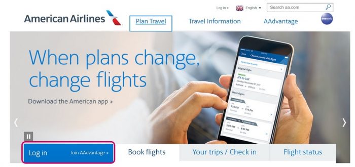
The screen shot below of the American Airlines homepage shows the focus being clearly indicated with a blue box around the component, which has focus, and the link becoming underlined.
2. Ensure that colour contrast between text and background is sufficient
Low colour contrast makes it difficult for users with certain vision impairments to read content. As stated by WCAG (to level AA), colour contrast should be at a minimum 4.5:1 for small text (14px or less), or 3:1 for large text (18px or 14px and bold). Sufficient colour contrast is particularly important when considering mobile design because glare from mobile screens often makes it more difficult to tell the difference between colours on the screen.
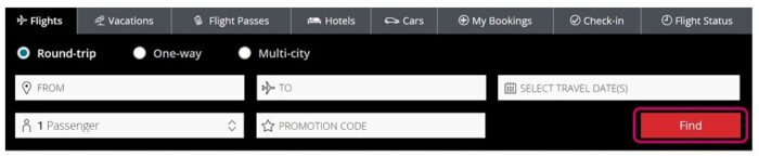
The screen shot below of the Air Canada homepage shows white text on a red background (Find), which has a colour contrast of 4.9:1. This makes it easily readable for all users, including those with certain vision impairments.
3. Do not rely on colour alone to communicate information
Information should not be conveyed using colour alone, because users with colour deficiencies may not be able to differentiate between elements, or interpret information correctly.
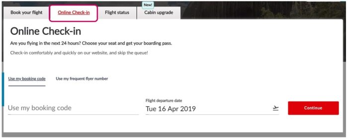
Other than different colours, use shapes, patterns or text to distinguish between elements. For example, in the screenshot below of the Avianca homepage, the Online Check-in tab is selected. This is indicated not only using colour (the selected tab is in red and the rest are in black) but the selected tab text label is also underlined, whereas the others are not.
There are many other considerations an airline needs to make to ensure its website is accessible (check out our other post for some more tips). Investing in accessibility makes sense. It not only ensures a better user experience for everyone, but it also makes financial sense. The spending power of people with disabilities is massive. For example, in the United Kingdom, there are approximately 4.3 million disabled people who shop online and would leave a website if it was inaccessible; their combined spending power is £11.75 billion. By not ensuring that your website is accessible, you are alienating a large group and could be losing out on a lot of potential extra income.
Get in touch with our experienced consultants to ensure that your website or app is fully accessible.
As an experienced accessibility research agency who Alzheimer’s Society have partnered with twice before, they partnered with us to help support ...
As an experienced accessibility research agency who Alzheimer’s Society have partnered with twice before, they partnered with us to help support them......