Subscriptions: A love-hate relationship
- Frankie James
- Jun 30, 2025
- 4 min read
Updated: Jul 25, 2025
When you’re on the lookout for a new product or service, the chances are that you’ll come across an option to buy it as part of a subscription model. Whether it’s a streaming service, food box, tracking app, or even toilet rolls, most of us have several of these recurring payments leaving our bank account each month. But how many of them have really got you hooked for the long run, and what is it that could make or break your relationship? In this article, we share some of our UX loves and hates for subscriptions.
What we love:
Convenience
In a world where most of us have busy lifestyles, one of the main benefits of subscriptions is convenience. Users no longer have to think about going to the shops or re-ordering products, and decisions such as what to cook for dinner can be simplified too, saving significant amounts of time as a result.
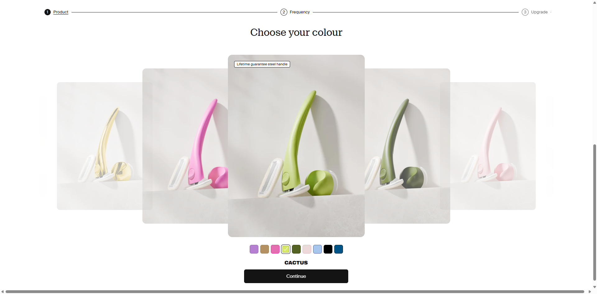
To retain customers, it is important for this ease to be reflected during the sign-up process and ongoing interactions. We love interfaces that make it simple to input preferences in a few clicks, by displaying only essential fields, with visually clear options. Offering a progress bar also helps support user expectations, confidence and navigation, to reduce the risk of abandonment.

Flexibility & control

No one wants a build-up of surplus products or to pay for something that they aren’t going to use, particularly if one of the aims of subscribing is to be more eco-conscious!
Subscription services have the difficult job of predicting and catering for different and changing levels of usage amongst users. We love companies that provide clear tiered options upfront and give the user control to cancel, pause, or modify their subscription quantity, frequency and schedule at any time. Proactive prompts before dispatch are even better, as they reduce reliance on memory and often enable a quick response such as to ‘Skip’ a delivery, saving users both time and money.
Personalisation
It’s essential for subscriptions to offer ongoing value to deepen customer engagement and loyalty. While making continuous improvements to the core product or service is key, one of the other ways to add value is through personalisation. We love services that analyse and learn user behaviours and preferences over time and use this to improve the experience.
Streaming services excel in this space by recommending shows and movies or creating custom music playlists to help reduce choice fatigue. Whilst trickier for physical products, some personalise orders based on goal setting, past choices and feedback, though providers should carefully weigh up the benefits when this adds to the user’s workload.

What we hate:
Subscription admin
With an increase in the availability of and subsequent sign-ups to subscriptions, comes more payments and platforms for users to manage. Whilst many require little in terms of ongoing input, others such as food and drink subscriptions require users to select meals each week or rate the wines from their last box. We hate it when admin begins to detract from the convenience of a subscription due to long or confusing journeys. Management tasks should offer a simple process for users to follow, by introducing timely notifications, clear layouts, intuitive navigation with minimal steps, and automation where possible. For example, providers should start by making personalised decisions based on data, with the option for users to modify their choices later if desired.
Endless upgrades

We get that subscription companies are out to make money, but it can sometimes seem like you’re being asked to pay an extra £2 here and an extra £5 there every month. This can impact budgeting as outgoings fluctuate each month, yet can also lead to dissatisfaction and reduced trust, as users begin to question the value they are getting for their base payment. We hate seeing repeated prompts to upgrade or purchase add-ons, that overwhelm or add pressure onto users. In particular, when paid content is mixed in with free content, or prices are shown ‘per person’, this lack of transparency increases the risk of costs being overlooked or miscalculated.
Difficult cancellation
We’ve all experienced that time when you go to cancel a subscription and spend 15 minutes clicking around the app or website to find that elusive button. Even when you locate some instructions, the steps often don’t seem to be possible, and you end up feeling frustrated and manipulated at having wasted so much time. We hate cancellation processes that are hidden, require multiple steps, or force contact with customer services. Not only does this lead to short-term distress, but users are also unlikely to return to the provider, instead favouring more transparent alternatives. Meanwhile, a good user experience and seamless cancellation process may encourage some to return to the platform when their circumstances change.
So, next time you are signing up for a subscription, try looking beyond the initial perks to ensure you’re going to love the experience in the long run too!
If you need any advice on how to give your customers the best user experience, please contact us by clicking on the 'Get in touch' button.


