
Why Designing for Parents Makes Your Product Better for Everyone
Updated: 1 day ago
I’d like you to put yourself into a situation I was in a year ago…
You’ve just completed your first solo train journey into the city with a four-month-old. Victory feels close, but as you precariously bump the pram off the carriage - one-handedly, while balancing a screaming baby in the other arm – you realise you need your digital ticket for the barrier. Pram brake on. Phone wobbling in your left hand. Commuters rushing past as you desperately search for the correct screen with a single thumb... Welcome to the ultimate usability test!
It can be easy when designing (and even testing) digital products to fall into the trap of assuming users will always be sitting comfortably, focused, and with both hands free. But interactions rarely happen in ideal conditions – especially when you’re a parent.
Let’s explore some situational disabilities to consider that will help optimise your designs for everyone.
1.One-handed operation (“The Limpet”)
The situation: Holding, carrying or feeding a child often leaves only one hand (and precisely one thumb if holding a device) free for interaction.
The impact: Buttons located near the top of the screen force awkward hand-shuffling and increase the risk of dropped phones. This is particularly true as smartphones continue to increase in size, with around 6.5 inches (diagonally) now considered typical.
Design tips:
Position primary controls (e.g. navigation bars) within the easy to reach "thumb zone" near the bottom of the screen, considering both left- and right-handed use.
Ensure touch targets are large and distinct to accommodate reduced precision.
Avoid fine motor interactions that cannot easily be performed with a single thumb such as pinch to zoom, two-finger taps and drag and drop.

2. Divided attention (“The Whirlwind”)
The situation: Fatigue is a parent’s middle name, with your bandwidth constantly split between trying to complete a task and simultaneously attending to your child – whether they’re climbing on furniture, demanding a snack or repeatedly asking “why?”
The impact: Lengthy processes, unclear navigation or complex content leads to higher error rates, missed details, and sudden session abandonment. What may initially seem like a small friction point has the potential to become a huge point of frustration.
Design tips:
Streamline tasks into small, digestible steps, with clear progress indicators.
Design for interruption by automatically saving progress, offering a simple way to extend time-outs, and allowing users to pick up right where they left off.
Guide tired eyes with a clear visual hierarchy that is free from unnecessary content and promotes recognition over recall.
Use clear, concise language that can be processed quickly when attention is divided.
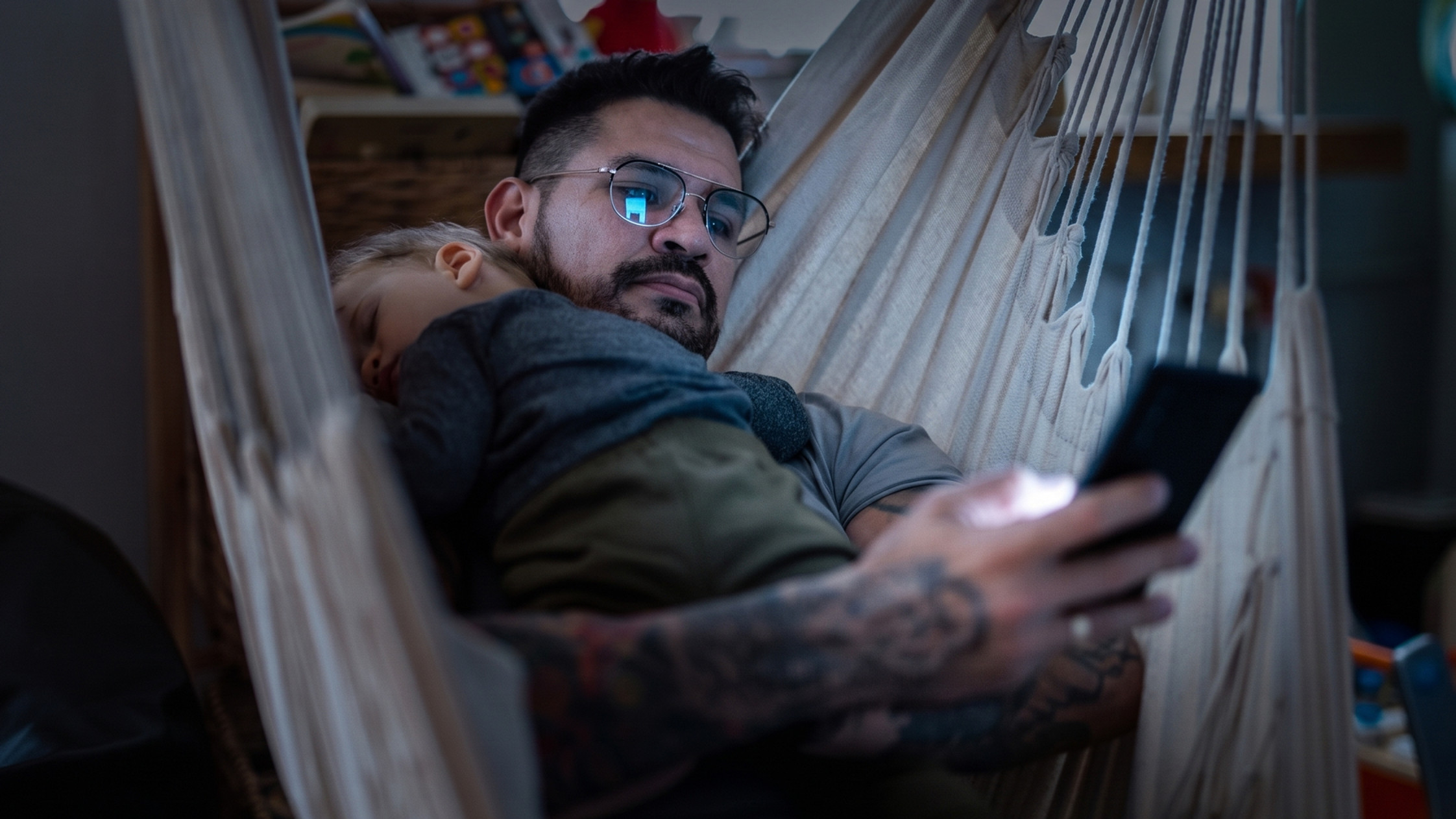
3. Muted audio (“The Sleep Thief”)
The situation: You’re sat in a dark room, trapped under a sleeping toddler until they fall into a deep sleep. To avoid waking them (and starting bedtime all over again), you and your phone must stay completely silent, with screen brightness at a minimum.
The impact: Any functionality that relies exclusively on audio or speech cues for alerts, instructions, or verification becomes unusable. Meanwhile, sound that plays unexpectedly creates instant panic, leading to an emergency exit from the app.
Design tips:
Avoid auto-playing media, and require an intentional, explicit tap to start audio to prevent accidental playback.
Provide automated closed captions on all audio and video content by default, to ensure no information is lost on mute.
Pair audio notifications with clear visual and haptic feedback.
4. Glare and outdoor use (“The Explorer”)
The situation: Your child loves being outdoors, which means you’re constantly trying to get tasks done in direct sunlight, squinting through harsh glare, fingerprints and the inevitable cracks on your phone screen.
The impact: Reflections make content difficult to read, particularly when text is small and has low contrast against the background. Critical information and calls to action can be easily overlooked, leading to missed steps and user frustration.
Design tips:
Follow WCAG (Web Content Accessibility Guidelines) requirements for readable, adjustable text and high colour contrast across all design elements.
Use a strong visual hierarchy with clear headings and distinct icons, allowing content to be scanned and digested easily.
Support system-level light and dark modes and ensure automatic adjustments maintain high readability across different light conditions.
Conclusion
These are just a few ways that parenting can impact usability - life is full of interruptions and real-world friction that good UX must accommodate. While we’ve focused on situational challenges here, remember that these needs can be permanent too – for example the requirements for pram and wheelchair users often go hand in hand. Testing with a diverse range of users, including those with disabilities, will ensure that your product remains usable and accessible in even the most unpredictable scenarios.
If you need help optimising the usability, accessibility or ergonomics of your product, we’d love to chat! Get in touch by clicking on the 'Get in touch' button.


