Examples of good practice show way forward on digital accessibility
Now is the time to accelerate digital accessibility for people with a cognitive impairment, says UX consultant Lily Williams.
It’s great to be able to say that we’ve seen rapid progress in the field of digital accessibility in recent years. However, advances for users with cognitive disabilities have lagged behind those made for other conditions.
The Web Content Accessibility Guidelines (WCAG) 2.0 document has driven a wider understanding of how to create accessible content for certain user groups. For instance, simple steps like adding alt text and ensuring sufficient colour contrast for images, have made a difference for those with visual impairments.
Now it’s time for better solutions for people with a cognitive impairment. This area represents a real opportunity for progress, and more research and discussion is needed to drive it forward.
What is a cognitive impairment?
Cognitive impairment is an umbrella term for many different disabilities, conditions or disorders that can range from mild to severe. Associated symptoms can include: short / long term memory difficulties; frequent sensory overload; attention deficit disorders; slow processing speeds; issues with problem solving; literacy challenges and more.
All users benefit
The great thing about implementing digital content that is cognitive friendly, is that all users benefit. You will never hear users say a website is too easy to use.
Alongside the examples below, 6 techniques and approaches are outlined. These will increase accessibility and usability for people with cognitive impairments.
6 Examples of good practice
1. Images
Images, icons and graphic content can really help a user with a cognitive impairment. For example, people with Dyslexia may find it challenging and time consuming to access textual information. This can be simply addressed with the use of relevant images.
On the Gov website, when beginning a student finance application, imagery is used very effectively. The copy states the length of time required for the application, and informs a user they will need their National Insurance number. Presented alongside the copy are two very simple graphic images; one of a National Insurance card (where you can find your number), and one of a clock.
This example shows how simple changes can have a positive impact for anyone who struggles with literacy.
It is important that any images are presented alongside text. This is particularly so for icons. A common example of this can be seen in navigation menus on mobile applications.
On the eBay app, all the links are presented alongside clear text stating the purpose and destination. Users do not have to assume or guess what the icon is for.
Icons displayed alone do not provide sufficient information, regardless of how recognisable the icon is.
Again, this approach will benefit everyone’s user experience.
2. Auto-complete and suggestions
Suggestions and auto-complete functionality can be incredibly useful. Suggestions can ease navigation, especially for those who struggle with memory, or for people who find decision making a trigger for anxiety.
Auto-complete can also be immensly useful for those with difficulties with literacy and spelling. I take my hat off to Barclays – their search bar functionality has been implemented with universal design at the forefront of their outcome.
Upon opening the search box, you are presented with a message that reads ‘Not sure what to search for? Other customers found these helpful,’ following several links phrased in a relatable manner, such as ‘How do I find my sort code and account number.’
As well, they utilise auto-suggestions once 3 characters have been entered in to the search field, you are provided with several options relating to your input.
It would be great if they also provided suggestions for misspelt words (as seen on Google).
3. Clear interactive elements
It is important that all interactive elements (links, buttons, accordions etc) are easy to visually distinguish from content. A common example of this would be links that are only visually distinguishable by a choice of different text colour from content. WCAG 2.0’s success criteria ‘1.4.1 Use of Colour’ states –
‘Color is not used as the only visual means of conveying information, indicating an action, prompting a response, or distinguishing a visual element.’
Nielson Norman conducted an experiment with 30 participants showing eye fixation on interfaces. They compared two versions of identical webpages, which only differed in the use of strong, weak or absent signifiers on the interactive elements (buttons, links, tabs, sliders). Examples of strong designs would be contrasting coloured buttons and underlined linked. Contrasting to a ‘weak’ signifier such as link text without underline and ghost buttons.
The outcome of this experiment is so valuable: it shows that participants spent far longer looking at the ‘weaker’ pages, emphasising the importance of ensuring that all interactive elements are easy to identify. A user with a form of attention deficit would find a ‘weaker’ page very frustrating to interact with.
Again, Gov is great at doing this successfully. All link text is clearly underlined and buttons are styled clearly.
4. Form instructions and Error handling
We may have all encountered a situation where it just isn’t possible to complete a form. Errors can’t seem to be corrected and you end up having to guess what format is required for an input field. Problem solving can be a cause for immense concern for some users with cognitive impairments.
WCAG 2.0 contains several success criteria relating to this; 3.3.1 Error Identification focuses on ensuring that ‘users are aware that an error has occurred and can determine what is wrong. The error message should be as specific as possible.’
Furthermore, 3.3.2 Labels and Instructions aims to ‘have content authors place instructions or labels that identify the controls in a form so that users know what input data is expected.’
The BBC implement this well: when registering for an account and entering your date of birth, if an error is made you are presented with a very specific error message – ‘Oops, that date doesn’t look right. Make sure it’s a real date written as DD-MM-YYYY e.g. the 5th of June 2009 is 05-06-2009’
This is a great example of how copy can effectively address frustrations or confusion in completing form fields successfully.
5. Readability of content
WCAG 2.0 contains several success criteria that aim to make text content readable and understandable. Although these are mainly level AAA (which is not essential to meet in order to be compliant), it is important to remember accessibility isn’t about ticking boxes and being compliant. It’s about inclusion for all.
The principles of these success criteria are great. Particularly regarding abbreviations, reading level and unusual words:
There are many readability checkers online, one I recommend is the Juicy Studio Readability Test. This contains several reading level algorithms including: Gunning Fog, Flesch Reading Ease, and Flesch-Kincaid, that are very helpful in determining how readable your content is.
It is important not to assume that users know abbreviations by default. For those with learning difficulties or literacy challenges this is particularly crucial. Make sure that the expanded form, or meaning of abbreviations, is available.
Assistive technologies can be used by a number of different user groups. For example, screen readers (intended for blind users to access content on a computer or mobile phone) are often used by people with cognitive impairments to aid literacy. Some people may also find voice recognition software particularly useful. WCAG 2.0 states the importance of maximising compatibility with assistive technologies. It is important all elements are coded accurately; 4.1.1 Parsing states –
“elements have complete start and end tags, elements are nested according to their specifications, elements do not contain duplicate attributes, and any IDs are unique, except where the specifications allow these features.”
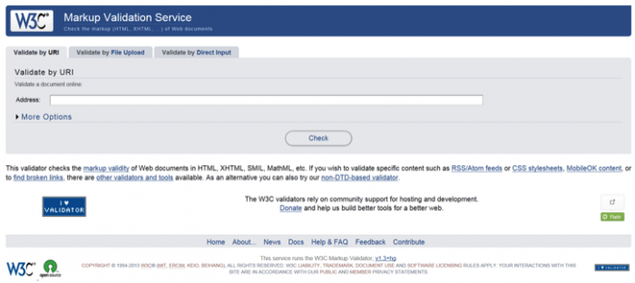
I would suggest using the W3C Markup Validator – this checks web documents and provides a list of any errors, ensuring maximum compatibility with assistive technologies.
Conclusion
The examples used in this article show how simple steps can materially improve digital accessibility for people with a cognitive impairment. As UX professionals we can play a key role in accelerating the development of better solutions in this area, implementing best practice while supporting further research and discussion.
Blind users have shown us that if used incorrectly, WAI-ARIA can generate additional issues. Avoid these 3 mistakes to improve website and application...
Blind users have shown us that if used incorrectly, WAI-ARIA can generate additional issues. Avoid these 3 mistakes to improve website and application accessibility....
 Examples of good practice show way forward on digital accessibility
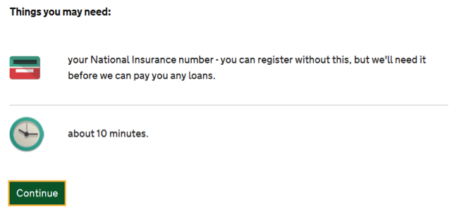 This example shows how simple changes can have a positive impact for anyone who struggles with literacy.
 Icons displayed alone do not provide sufficient information, regardless of how recognisable the icon is.
 Again, this approach will benefit everyone’s user experience.
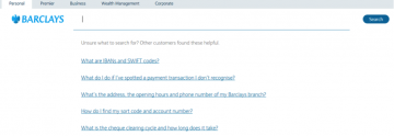 Upon opening the search box, you are presented with a message that reads ‘Not sure what to search for? Other customers found these helpful,’ following several links phrased in a relatable manner, such as ‘How do I find my sort code and account number.’
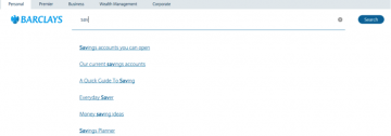 As well, they utilise auto-suggestions once 3 characters have been entered in to the search field, you are provided with several options relating to your input.
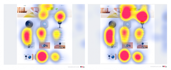 The outcome of this experiment is so valuable: it shows that participants spent far longer looking at the ‘weaker’ pages, emphasising the importance of ensuring that all interactive elements are easy to identify. A user with a form of attention deficit would find a ‘weaker’ page very frustrating to interact with.
 Again,
 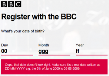 The BBC implement this well: when registering for an account and entering your date of birth, if an error is made you are presented with a very specific error message – ‘Oops, that date doesn’t look right. Make sure it’s a real date written as DD-MM-YYYY e.g. the 5th of June 2009 is 05-06-2009’