Research and ideation for a new travel management platform
A corporate travel company approached System Concepts to support the development of their brand-new travel management platform. Their aim was to ...
 The BBC is not only the world’s oldest national broadcasting organisation: it’s also the largest, with over 20,000 employees. A variety of part time, flexible and contract staff swell the total to over 35,000.
Delivering the BBC’s services involves people operating in a wide variety of environments and locations. Insights into how this diverse workforce collaborates, coordinates and communicates at work is pivotal to ensuring positive user experiences across the systems and tools they use. We were hired to conduct user research to further this understanding.
“System Concepts came in when we had very limited data on BBC employees. What they have delivered is a useful starting point for future UX work.”
Dr Karen Yunqiu Li, Senior Human Computer Interaction Specialist, BBC
Our brief was to provide research insights into the needs, behaviours and environmental factors experienced by users and to understand how BBC staff communicated, coordinated and collaborated with their stakeholders. This would enable the BBC Enterprise IT team to optimise and better support the business critical systems and tools used by staff, contractors and freelancers. We knew that the user types research would generate a lot of data, so from the outset we saw the involvement of our Creative Services specialists as key to communicating insights effectively.
Providing a good user experience aids service delivery and performance, so we were tasked with researching issues including:
Our research methodology for building a set or user types encompassed four phases:

Over 900 surveys were completed by BBC employees, revealing different user patterns and categories. Our team collaborated closely with the BBC while undertaking the survey data analysis. This process spanned several iterations in order to identify the types of insights sought, using a variety of specialist survey and data analysis tools.
We applied sampling techniques to select representatives to talk to in more depth – initially through a group of 21 employees that undertook the 7 day diary study.
A subset of 15 participants went on to be interviewed. Where practical these interviews took place in employees’ workplaces, so we could observe their environment first hand.
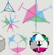
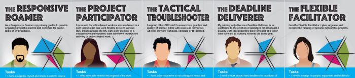
Following the detailed data analysis, our Creative Services team proposed several alternative visual design approaches. We visualised 5 user types, along with maps depicting the personal and professional objectives of each, and the internal systems and tools they adopt.
Again, this was an iterative process involving close dialogue with the BBC UX team, ensuring the most comprehensible approach for users. These visual designs were how the research results were ultimately presented – there was no reliance on a lengthy written report.
Through our creative data visualisation, user types and maps enable the BBC Enterprise Systems IT team to rethink the use cases in particular business areas. Then they can either tailor the configuration to meet those needs, or come up with communications that will make sense to and be easily followed by users.
“We used it as a conversational piece to show people the starting point of multiple use cases, that they can build on top of the modes of working.”
Dr Karen Yunqiu Li, Senior Human Computer Interaction Specialist, BBC
Paul Thorpe, our Creative Services Director, summarises, “We wanted to produce designs that would enhance the data findings, make the 5 user types meaningful and easy to communicate, and capture the imaginations of those with the power to implement change. To achieve this, we had to convey the stories of each user type powerfully and effectively.”
 Improve usability with creative data visualisation
For expert assistance, get in touch.
A corporate travel company approached System Concepts to support the development of their brand-new travel management platform. Their aim was to ...
Our client wanted to better understand a sub-set of vulnerable customers, to build empathy and identify the crucial user needs to consider for this ...
A payment services and software provider was looking to launch a new electronic point of sale (ePOS) system within the UK. To address the breadth of ...